Annual check up
 |
By Denis Flanagan
I’m sure most of your annual plantings are near completion by now, so it’s time to put a maintenance schedule in place to ensure healthy growth.
During the coming weeks it’s also a good idea to make notes on combinations that work well together and take notice of trends that are emerging in the industry. For the past three years, Landscape Ontario and the University of Guelph have partnered in planting and maintaining trial gardens for recent introductions. This has proven to be a great resource for testing planting techniques, colour combinations and collecting feedback from consumers, garden writers and the industry. I hope you will find the following tips useful for fine-tuning your future annual displays.
Trends
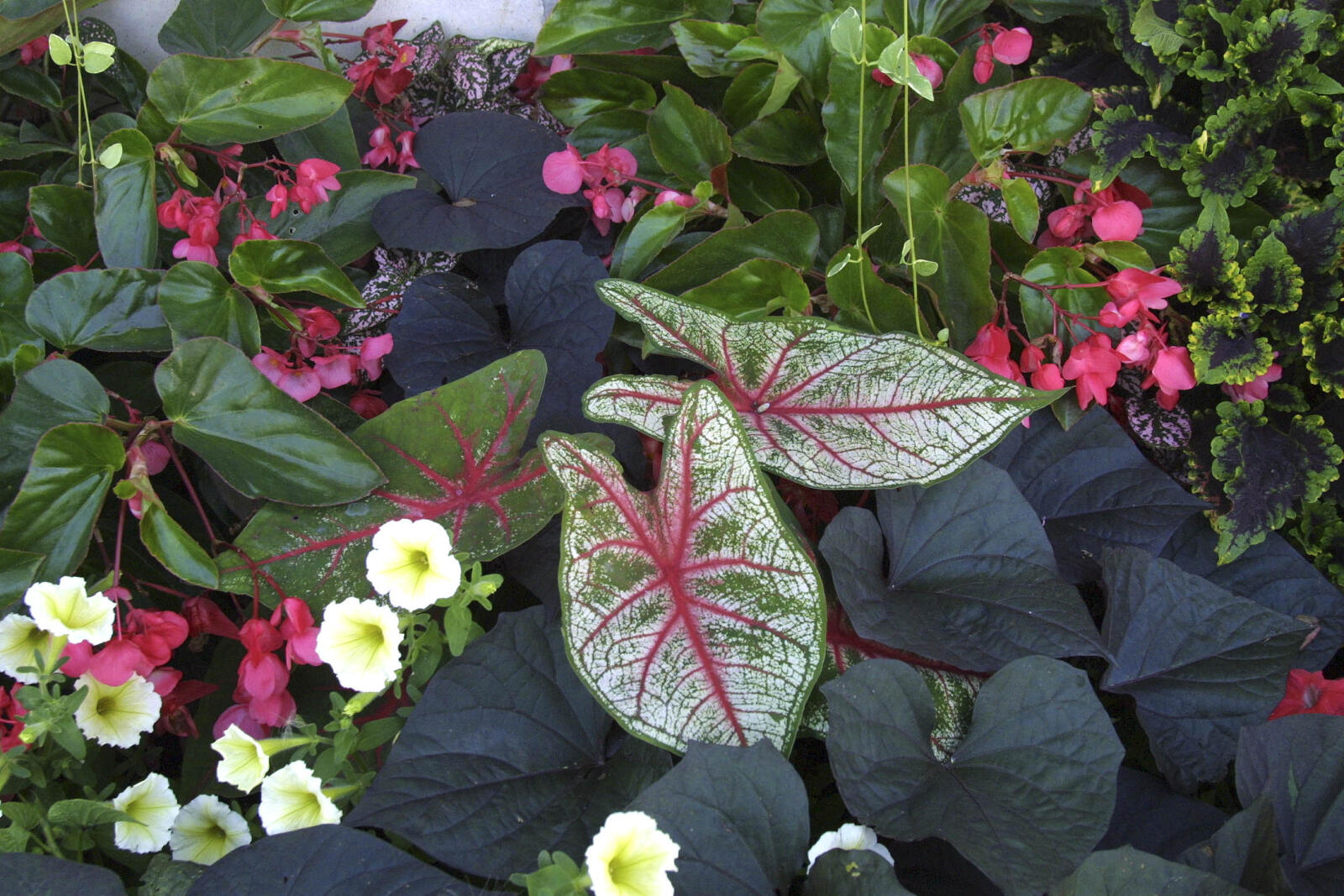
With the current trend to naturalize large areas of our landscapes and often because of budget restraints, annual displays in general have been reduced in size, often meaning we have to be more creative with combinations of plantings for impact. It’s not always possible to rely on massive beds of impatiens or begonias for that “wow factor” — homeowers and property managers are often looking for more sophisticated displays.
Colour 101
From fashion to cars, colours are woven into our everyday living, and the same emotions, reactions and psychology apply to plants. It’s useful to know how colour affects our decision-making process.
- White
White suggests purity and innocence, cleanliness and precision. It can be hard on the eyes after long periods and needs to be softened with other colours. Imagine being “snow blinded” and you can understand why using other colours is important. Use white in areas needing an organized and well laid out appearance. White flowers stand out in the landscape well into dusk, therefore they are great for landscape areas used in the evening. Restaurant and patio plantings can appear more elegant with white flowers. Outline pathways with white blooms to help guide visitors in the evenings. Use white as an accent around entrances of offices and business buildings. - Yellow
Yellow is very eye-catching despite the fact that our eyes have a hard time processing this colour. It is known to stimulate memory. There is a psychological association of yellow with sunshine, and short-term exposure to this colour will give people an energy burst. Combined with the energizing effect of red, yellow can be very effective in getting attention. It is therefore an excellent choice for planting near signage, entrances, street numbers and mailboxes. - Purple
Traditionally, shades of purple and violet suggest romance and imagination. But over long periods it can be a difficult colour to live with. Purple helps lower blood pressure and suppress appetite. Try not to use it in areas where food sales are important. Use purple in areas where romance or imagination and illusion are predominate in the landscape theme. Purple is a fun colour. - Red
Red is visually easy on the eyes. It is a highly emotional colour that may stimulate feelings of love and impulsiveness, and can elicit sensations of excitement and heat. Red is a “touch me” colour — people like to touch red objects. Red flowers bring the garden forward. In an area that is long, red will help to “shorten” the view. People have been trained to think of red as a signal, so place it in an area where you want people to stop. Men favour yellow-based reds, while women prefer white-blue based reds. By knowing this, you can create a garden aimed toward a particular gender. During the cool season, using warm shades of red will help create a feeling of warmth. For landscaping in areas where entertaining and food are involved, shades of red will help stimulate appetite and conversation. - Blue
Blue is the easiest colour for the eye to see, and is considered the most restful and calming colour. It is also considered non-threatening, and a colour of trust and dependability. Blue is also often associated with authority and power. Visually, blue will help to expand the space and make gardens look larger and wider if planned properly. If there is a southern or western exposure area that tends to heat up, then a splash of blue flowers in the landscape will help to “cool it down” visually. Light shades of blue will create a refreshing atmosphere. Dark blues are effective where formality is required. Blue will be the first colour to disappear in the evening. - Pink
Pink brings thoughts of sweetness and innocence to mind. Pink is also known to have a short-term calming effect on people. People will try to sniff the pink blooms before any other. Use pink in areas where viewers tend to be stressed or have high levels of energy. Combined with blue, it may help to reduce tension and stress levels. Pink helps add a sense of “naturalness” to a garden.